Thursday, December 17, 2009

Waves and Tides: Shaquille O'Neal Kitchen


Our last project for studio was to design a kitchen for Shaq. I had to think about the height of countertops and the length of toe-kicks. My concept is waves and tides since his house is located in Miami, FL. How waves and tides go up and down and in and out reflect how families are never perfect and there are always up's and down's and chaos especially when you have 6 children like Shaq does. My design reflects my concept and the needs of the O' Neal family.


Thursday, November 12, 2009

Waves and Tides logo

SYTYCD contest this week was to design a logo for our concept for our kitchen design studio project. I chose to put mine on a gray/blue color paper and write my concept in the middle. The text is surrounded by simply drawn waves. The media I chose is pen and colored pencil.

Concept: Waves and Tides


This week we had to make another poster, but this time it had to be about our concept for our kitchen design studio project. These are the two hand sketches I did that are on my poster. They are abstracted sketches of my concept, which is waves and tides.

Thursday, November 5, 2009

Entenza House Composition Poster

This weeks assignment was to composite all of our drawings from the Entenza House: Case study #9 and make a poster with all of them on it. It includes an axonometric, a perspective, a section, a floor plan, and an elevation. This assignment was fun organizing the poster. I think I could of done a better job with my text and how it was incorporated into the design.

IAR 211-02 Blog Title Design

Our So You Think You Can('t) Draw contest this week was to re-do any of the assignments from this semester so far. I chose to do one of the first ones because I had mis-understood the assignment the first time and so I re-did it the right way this time. The top image is the first one and the bottom one is the re-do.

Friday, October 30, 2009

HaPpY HaLlOwEeN!!!!

Here is my haunted house with a short little story to go along with it. Enjoy!

Axonometric of Entenza House Case Study No.9

In drawing we had to make an axonometric out of the Entenza house. I decided to ghost the two walls that are closest so more information is revealed. I enjoyed this project as I tried a new style by only having a few colors as opposed to 10 or more.

Friday, October 23, 2009

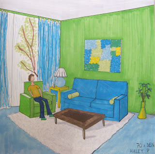
70's Den

So you think you can't draw this week was to draw a perspective of any room with a certain style so I chose to do a 70's theme.

Name Tag

Here is my name tag from the beginning of school that we made for drawing class.

Wednesday, September 23, 2009

Color Change

For this perspective, I wanted to change some of the colors in the room while keeping others.  If a client comes to you and you have green walls in your drawing, but they don't like it, then you can very easily go in photoshop and change it to some other color that will please them.  I am not a big fan of the very bright blue walls, so I decided I would try red with a blue ceiling.  I used the lasso tool to select the walls and then used the paint bucket to fill in the space with the red color I chose.  I also dulled down my shadows with the dodge tool again.  By changing the color of the walls, it really does give the room a different feel.

Smeared

In perspective everything has a smeared look almost.  I made some of the lines, and the shadows especially, very soft.  I used both the dodge and burn tool as well as the stamp tool for the floor.  The effects I have done to my perspective makes it have a very relaxed feeling.

Glow

In this perspective I chose to make it glow.  I made the lines more bold, added lines on the windows so they were not just black and then made my shadows lighter with the dodge tool.  I like it because it really shows an emphasis on color instead of structure.

Tuesday, September 22, 2009

Thursday, September 17, 2009

Rendered in 3 styles

We had to draw one view from our sketchup design and draw them in three different styles and papers, but with the same color scheme from one of Maud Gatewood's paintings.  The painting I chose is at the bottom.


Here is my best one of the three.  It is the tightest one and is done on marker paper.


Here is my middle one and is done on vellum.

    Here is my loosest one and is done on tracing paper.  I need to work on my scale figures and the loosness of the lines and make them more bold and thick.

                                                                         gatewood_woman_calling.jpg

Tuesday, September 15, 2009

Martha's Vineyard renovation house [Edgartown, MV]


Here are some pictures that I took when I toured this house in Martha's Vineyard when I was there on vacation.  The house is located in Edgartown, MV and was a habitat for humanity house.  Every room and section of the outdoor landscaping was done by a different designer!  I really enjoyed touring this house and thought I would share some of the pictures I took.

Room Perspecitves

First we took a picture from a magazine of a room and used it for inspiration to create our own room.  I took the furniture from my magazine cut-out and put in my room.  I wanted the outdoors to come in, so there is outdoor furniture and lots of windows with wooden beams on the ceiling and the walls.  Media: pencil.


Then from the above perspective, we made a floor plan and decided how the other side of the room looked.
Then from the plan we made a perspective of the other side of the room and used black pens to show different light weights.

Tuesday, September 8, 2009

Joint


In drawing we have a contest every week called "So you think you can draw..."  This week we had to draw a joint and show how its connection.  I came up with drawing logs with a pin down the middle to show how it connected and what area I am focusing on.